Neighbourhood Studio
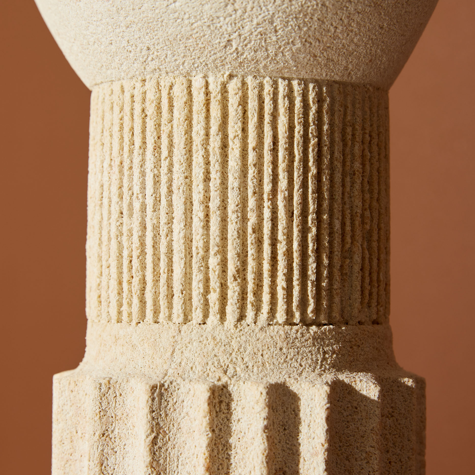
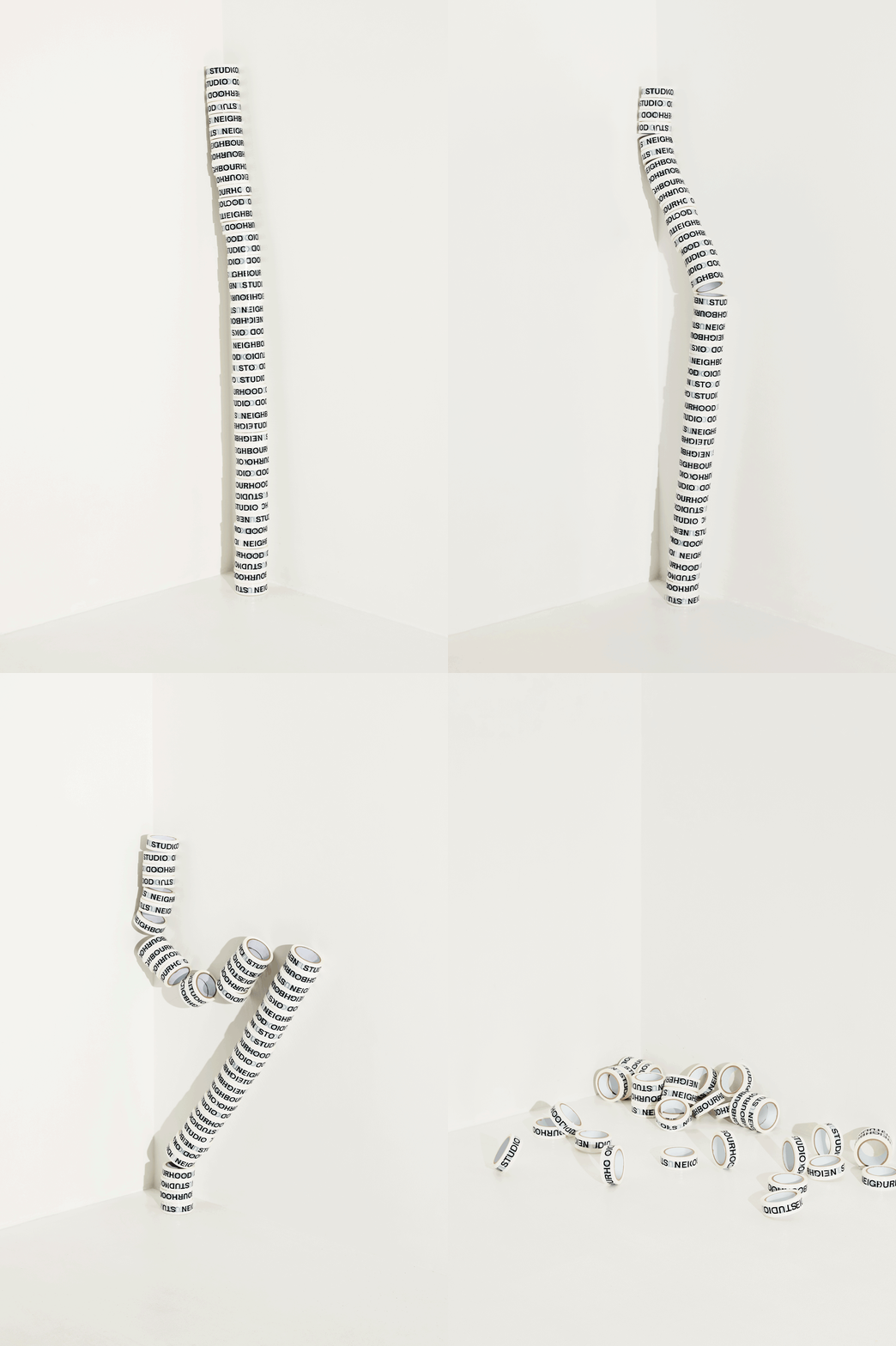
Neighbourhood Studio is the sculptural practice of Lucas Wearne. Best known for his natural limestone sculptures and hybrid objects that balance form, materiality and process, Lucas approached us looking for a new identity to clarify his visual communication strategy.
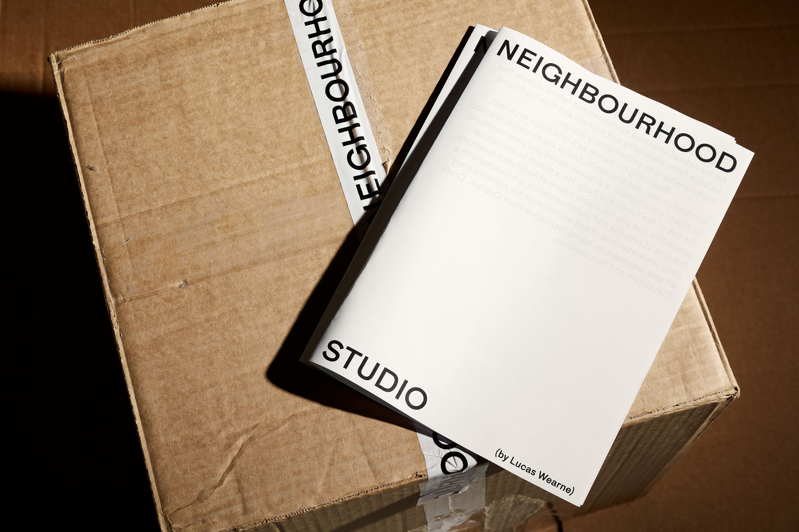
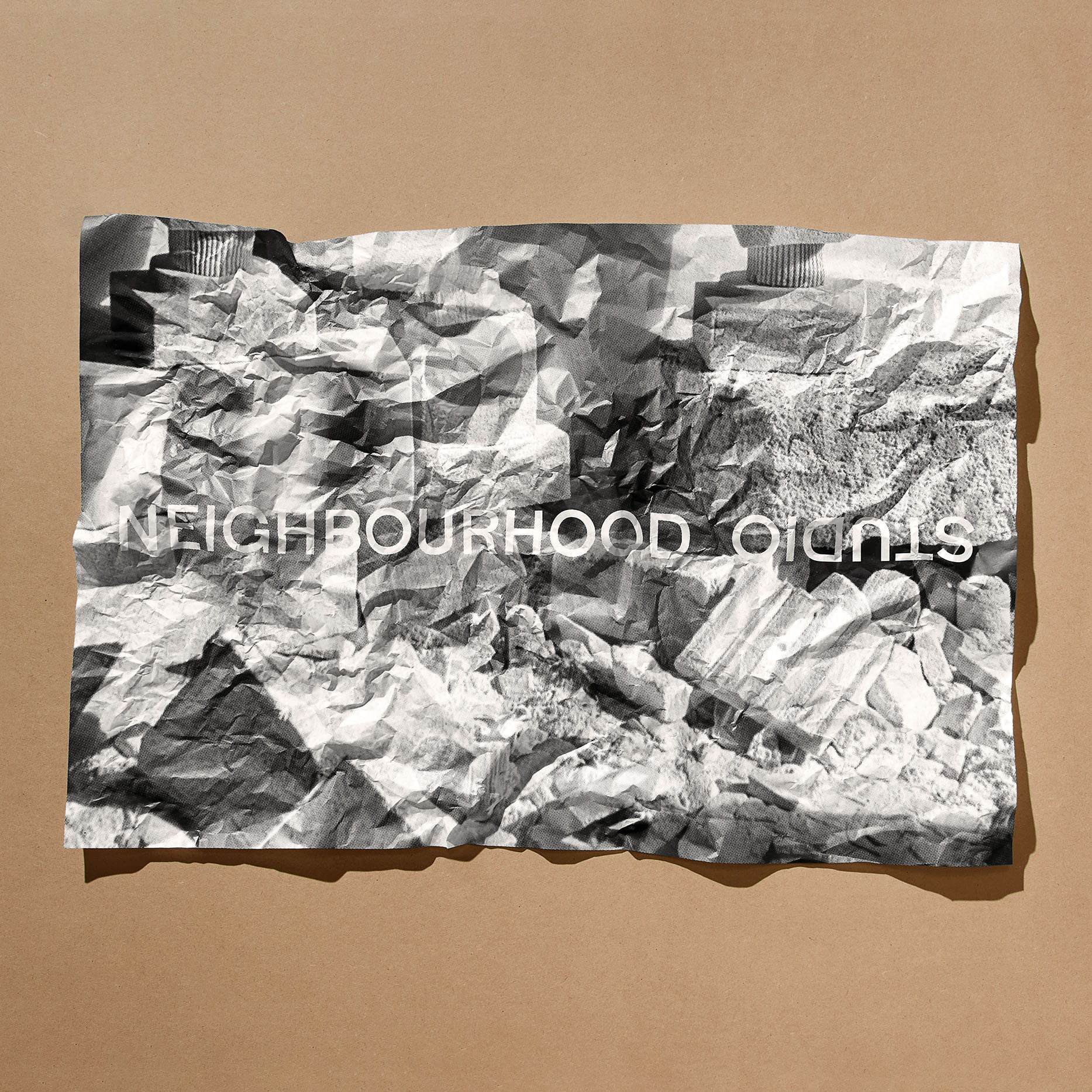
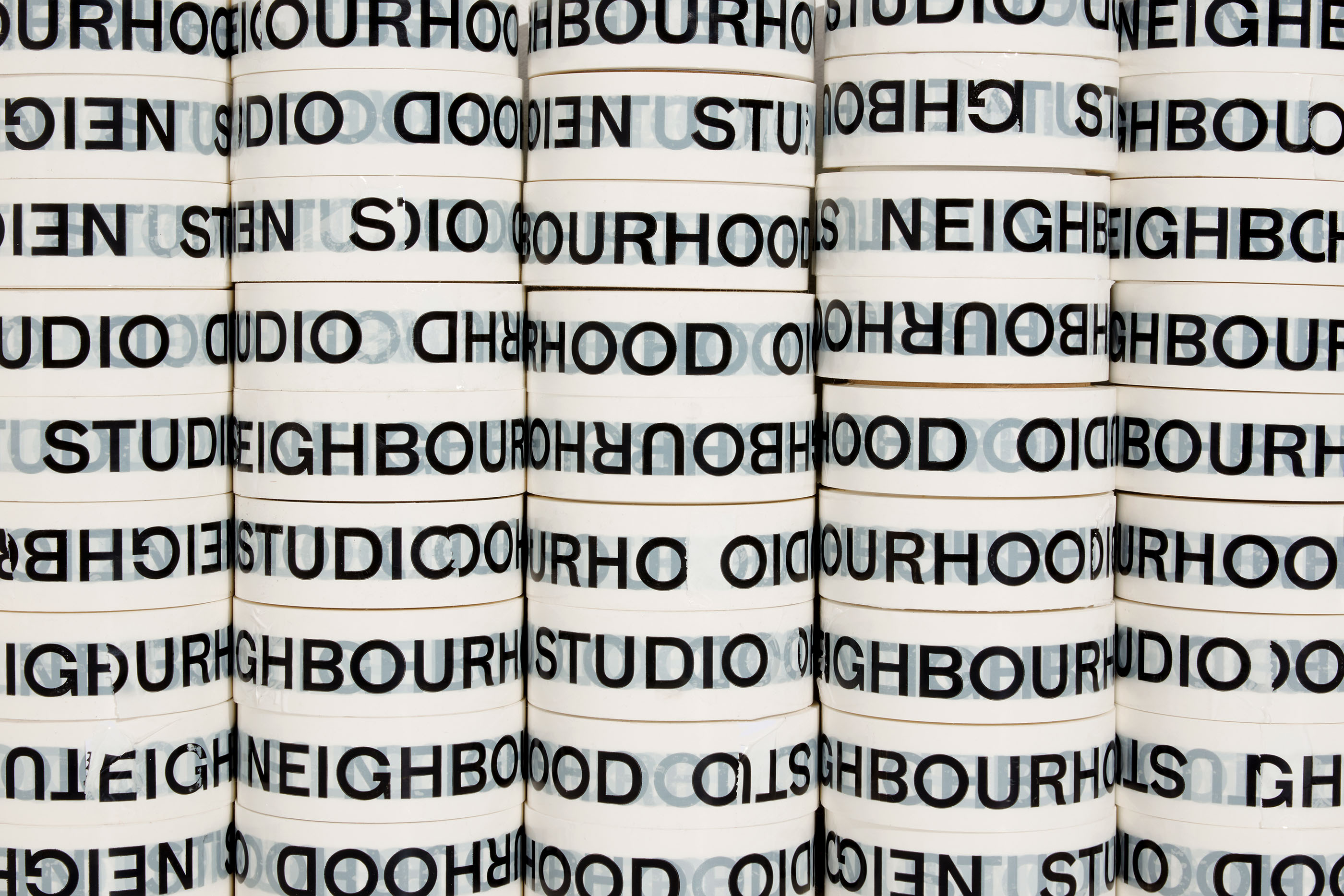
Initially identifying a disconnect between the name Neighbourhood Studio and Lucas as the artist and maker, the strategy we employed was to integrate Lucas' name within the identity to unite the brand and person behind it. The typographically-led identity is understated at it's core, revolving around a carefully selected typeface that is classic and elegant, but still has a playful and modern feel to it. The typographical language relies on differing scales and tactile elements to add interest across the brand applications.
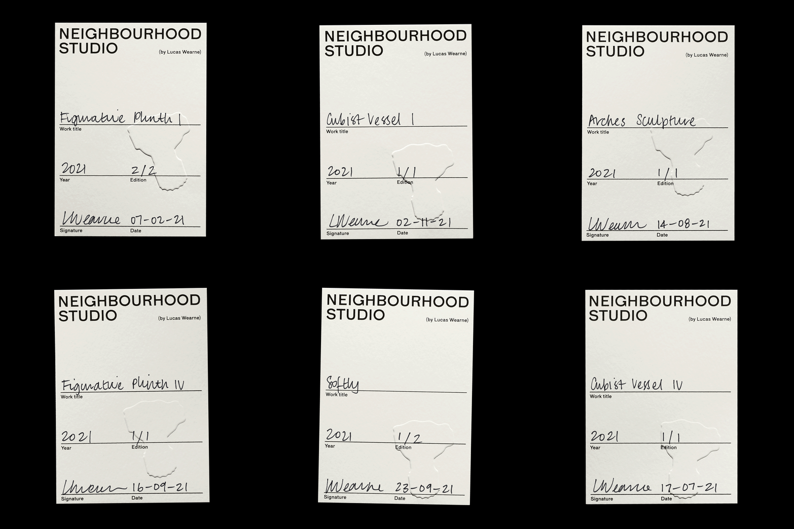
As Lucas works primarily with limestone, the papers used for this project were carefully selected to mimic some of the characteristics of the ancient stone; incorporating warm white tones and textures that reflect the characteristics of the limestone. An embossed finish has been utilised across the printed collateral to reflect the tactile nature of Lucas’ carved works.
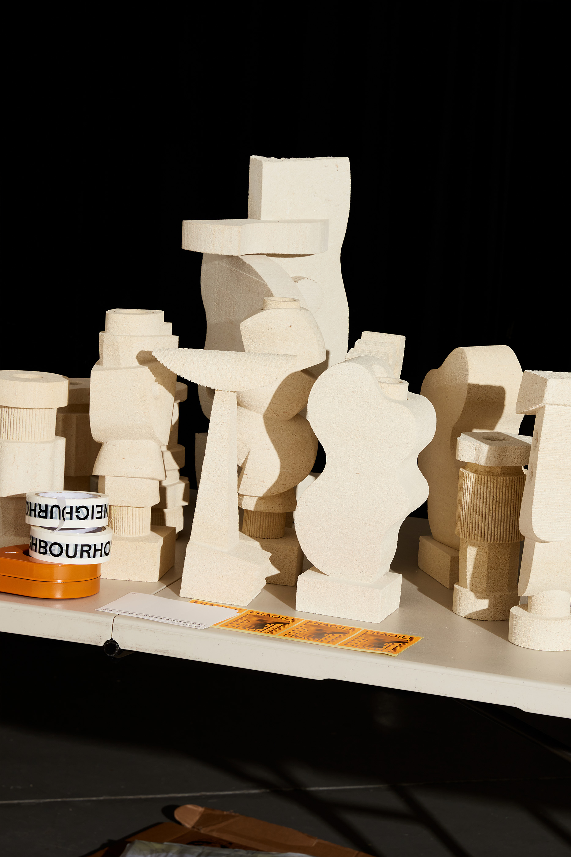
As a part of the brand strategy, we worked on the art direction of a series of images to represent Neighbourhood Studio. The resulting imagery, that appears across the website, is rooted in a core palette of beige and brown tones, incorporating various textures and strong lighting to showcase the shapes within the pieces.
Website: neighbourhd.com
Year completed: 2021
Photography by: Shelley Horan
Scope: Art Direction, Digital, Identity, Packaging, Print
Related projects:
